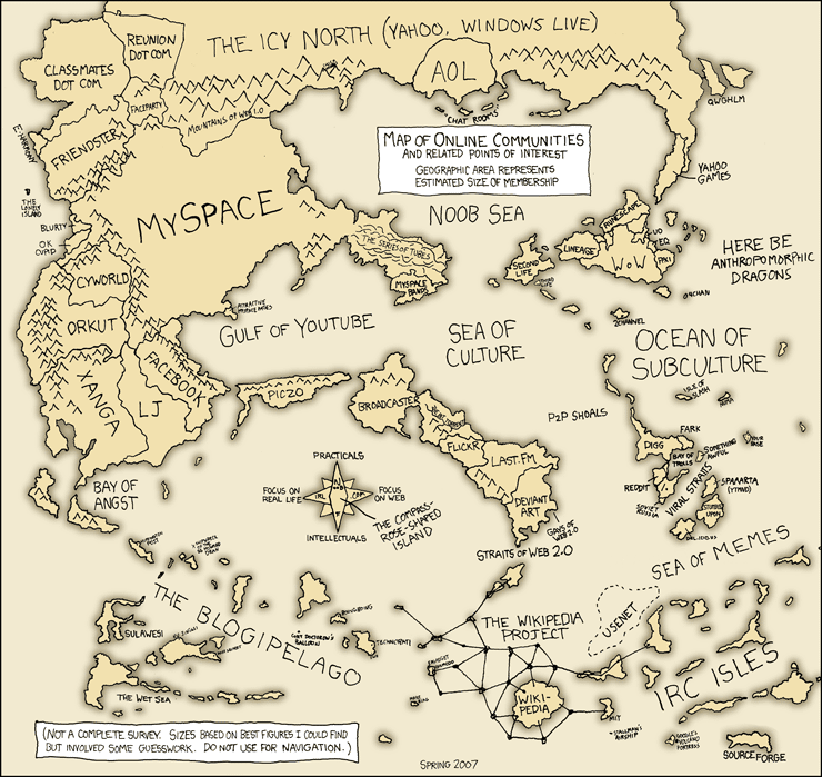
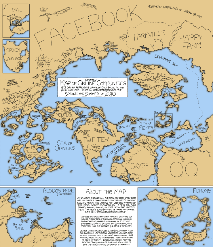
If online communities were drawn out like a map of the world, what would it look like?
I found these a few years back.
Comparing these fictitious maps of the Internet from 2007 and 2010, you see how much the topography of the web has changed in just a few years:
2007

2010

// via xkcd.com
If you tried to the same for 2014/2015, I imagine it would change, again.
Be looking back just a few short years, we can see how quickly the Internet terrain is evolving.
Crazy, isn’t it?
// HT ChurchMag
Leave a Reply